TL;DR:
- Matching outdoor lighting to your home's style involves selecting fixtures that align with your architecture's design language and create a cohesive visual impression.
- Layering ambient, task, and accent lighting with consistent finishes enhances both functionality and aesthetic harmony across your exterior.
Matching lighting to your home style means selecting fixtures and light qualities that align with your architecture's design language to create a cohesive, appealing exterior. The right outdoor lighting does more than illuminate. It defines your home's character after dark, signals quality to neighbours, and reinforces every design decision you made during the build or renovation. Brands like Hinkley, Visual Comfort & Co., and Troy Lighting each offer style-focused collections built around specific architectural vocabularies, from Colonial lanterns to mid-century pendants. This guide shows you how to read your home's architecture, choose the right fixtures, and layer light with intention.
How to match lighting to home style by reading your architecture first
The most reliable method for matching lighting to your architecture is to identify your home's design language before you look at a single fixture catalogue. Architecture communicates through silhouette, material, and proportion. Your lighting must speak the same language.
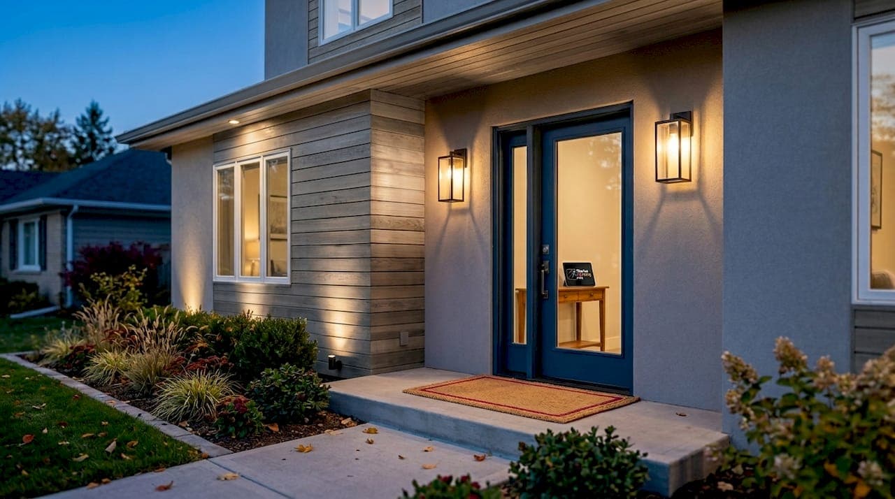
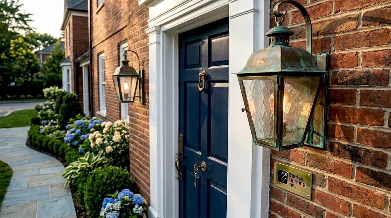
Colonial and Georgian homes call for symmetric lantern-style fixtures in brass or oil-rubbed bronze. Paired coach lights flanking a front door, or a pendant lantern centred above an entry, reinforce the formal symmetry these homes are built around. Scale matters enormously here. A fixture that is too small reads as an afterthought on a two-storey brick facade.
Craftsman and Arts and Crafts homes suit mission-style sconces with hand-crafted detailing, dark bronze or aged iron finishes, and art glass panels. The design philosophy of the Craftsman movement celebrated honest materials and visible construction. Your fixtures should reflect that. Avoid anything with a polished or lacquered finish, as it contradicts the handmade aesthetic entirely.
Farmhouse and rural vernacular homes pair well with black metal fixtures, cage-style pendants, and simple gooseneck barn lights. The Rejuvenation catalogue is a strong reference point for this style. Fixtures should feel utilitarian and unpretentious, with clean lines and no ornamental excess.
Mid-century modern homes demand restraint. Geometric, low-profile fixtures in brushed brass, matte black, or warm aluminium work well. Avoid anything with traditional ornamentation. The architecture is defined by horizontal lines and open forms, and your lighting should echo that.
Contemporary and minimalist homes suit sleek, recessed, or wall-wash fixtures with concealed light sources. The fixture itself should nearly disappear, letting the light do the work. Brands like Flos and Vibia specialise in this approach.
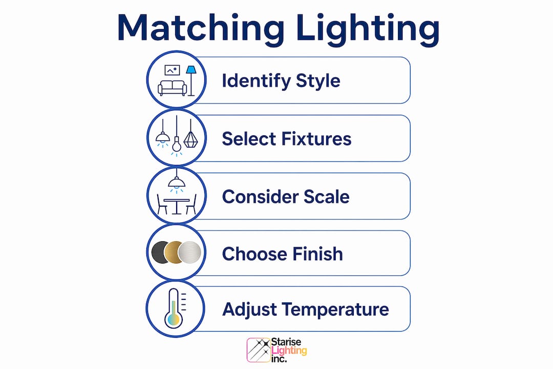
Correct fixture scale is as critical as style. Oversized fixtures overwhelm small facades, while undersized ones disappear on large homes. A useful rule: the fixture height in centimetres should roughly equal the door height in metres multiplied by ten.
Pro Tip: Photograph your home's facade in daylight and print it in greyscale. This strips away colour and forces you to see proportion, symmetry, and material texture clearly. Use that image when shopping for fixtures.
How to plan layered outdoor lighting for style and function
Layered outdoor lighting uses three distinct light types working together: ambient, task, and accent. Each layer serves a different purpose, and together they prevent the flat, harsh look that comes from a single overhead source.
Here is how to build each layer with style in mind:
-
Ambient lighting provides overall illumination and sets the mood. For outdoor use, this includes wall-mounted lanterns, post lights, and soffit-mounted downlights. Choose fixtures here that carry your primary style statement. These are the fixtures guests notice first.
-
Task lighting addresses specific functional needs: pathway lights that guide foot traffic, step lights that prevent trips, and entry lighting that allows you to find your keys. Task fixtures should be subordinate in scale to your ambient fixtures. They support the scene rather than compete with it.
-
Accent lighting highlights architectural features, garden elements, or textured materials like stone and brick. Uplighting a feature tree or grazing light across a stone wall adds depth and drama. This layer is where ambient outdoor lighting transforms a functional exterior into a designed one.
The key discipline in layered planning is maintaining finish and material consistency across all three layers. If your ambient fixtures are in aged bronze, your pathway lights and accent fixtures should match. Mixing finishes across layers is the most common mistake homeowners make, and it fragments the visual story your lighting is meant to tell.
Pro Tip: Sketch a simple plan of your home's exterior and mark where each lighting layer will sit before purchasing anything. This prevents the common problem of buying beautiful individual fixtures that do not work together as a system.
Why colour temperature and light control define your lighting's success
Choosing the right colour temperature is one of the most underestimated decisions in outdoor lighting design. Warm colour temperatures between 2000K and 2700K create softer light that complements traditional finishes and renders wood, stone, and brick in their most natural tones. Cooler temperatures above 3000K can make a warm-toned brick facade look clinical and grey at night, undoing the character your architecture works hard to project.
Beyond temperature, how your fixture distributes light matters as much as how it looks. Fixtures with significant uplight or glare can look visually wrong despite a perfect finish choice. A beautifully proportioned Colonial lantern that throws harsh uplight creates a halo effect that reads as cheap and uncontrolled, regardless of the fixture's quality.
The BUG rating system measures a fixture's backlight, uplight, and glare output. Lower BUG ratings indicate better-controlled light distribution. This metric matters for both aesthetic and regulatory reasons. Many municipalities, including those following Boulder County's outdoor lighting requirements, mandate fully shielded, downlit fixtures with no uplight or flashing. Compliance and good design point in the same direction here.
The practical takeaway is straightforward:
- Choose fixtures rated 2700K or warmer for any home with traditional or natural materials
- Select fully shielded or downlit fixtures to control glare and uplight
- Check the BUG rating before purchasing, particularly for street-facing fixtures
- Avoid cool white LEDs on wood, brick, or stone exteriors
For homeowners in Calgary and Edmonton, where exterior lighting compliance intersects with harsh winter conditions, choosing fixtures with proper shielding also reduces ice and snow accumulation around the light source.
How do fixture finishes and materials affect style authenticity?
Finish selection is where lighting design either earns or loses its credibility. Historic and period homes benefit from fixtures with aged or unlacquered brass and dark metals that develop a patina over time. The finish should feel as though it belongs to the same era as the architecture, not as though it was installed last Tuesday.
Matching the fixture finish's age to the home's materials maintains authenticity more reliably than period motifs alone. A Victorian home with a weathered copper roof and aged brick will look more cohesive with a verdigris or antique bronze fixture than with a brand-new polished brass one, even if the polished brass is technically period-correct.
Here is a practical finish guide by architectural style:
- Colonial and Georgian: Aged brass, oil-rubbed bronze, or antique nickel. Avoid polished chrome entirely.
- Craftsman: Dark bronze, aged iron, or hand-rubbed oil bronze. Matte finishes only.
- Farmhouse: Matte black or raw iron. Galvanised steel works well for barn-style fixtures.
- Mid-century modern: Brushed brass, warm gold, or matte black. Avoid anything with a lacquered shine.
- Contemporary: Matte black, brushed nickel, or architectural aluminium. The finish should be consistent and understated.
Polished chrome and bright nickel are the finishes most likely to create a mismatch. They read as industrial or commercial, and they reflect light in ways that draw attention to the fixture rather than the architecture. The guidance from Bravo London's approach to finish alignment reinforces this: the fixture's surface should support the spatial story, not interrupt it.
For high-end residential lighting projects, the finish conversation extends to hardware, door handles, and even guttering. When all exterior metal elements share a finish family, the home reads as intentionally designed rather than assembled over time.
Key takeaways
Matching outdoor lighting to your home's architectural style requires aligning fixture silhouette, finish, scale, and light quality with the design language your architecture already speaks.
| Point | Details |
|---|---|
| Read your architecture first | Identify your home's style before selecting fixtures to align silhouette, material, and proportion. |
| Layer ambient, task, and accent | Three lighting layers prevent flat illumination and create depth across your exterior. |
| Use warm colour temperatures | Fixtures rated 2000K to 2700K render traditional materials naturally and reduce harsh glare. |
| Match finish age to materials | Aged or unlacquered brass suits period homes better than polished modern finishes. |
| Control light distribution | Low BUG-rated, fully shielded fixtures improve both aesthetics and regulatory compliance. |
What I have learned from watching homeowners get this wrong
The most common mistake I see is homeowners who spend considerable time and money selecting a beautiful fixture, then install it at the wrong scale, in the wrong finish, or without any thought to how the light actually distributes. The fixture looks right in the showroom and wrong on the house. That gap between showroom and facade is where most outdoor lighting projects fail.
The second mistake is treating outdoor lighting as a single decision rather than a system. One statement lantern at the front door does not create curb appeal. It creates a spotlight on a dark facade. The architecture needs to be lit as a whole, with each layer contributing to a unified impression. I have seen homes where a single well-placed accent light on a stone feature wall did more for the property's night-time presence than four expensive wall sconces combined.
The third thing worth saying plainly: compliance is not the enemy of good design. The requirements that push you toward downlit, shielded fixtures and warm colour temperatures are the same requirements that produce the most visually satisfying results. Uplight halos and cool white glare are not design choices. They are symptoms of fixtures chosen without considering how light actually behaves.
The technology available now, particularly Gen 2 LED systems with programmable colour and intensity, makes it possible to get this right without compromise. You can have the warm, controlled, architecturally sympathetic lighting your home deserves and the flexibility to adjust it as your tastes evolve.
— Starise
Permanent outdoor lighting designed for your home's character
Co-starise specialises in permanent outdoor lighting solutions built for Calgary's climate and designed to complement a wide range of architectural styles. The Gen 2 24V LED system delivers warm, controllable light that suits everything from traditional Craftsman homes to contemporary builds, with app-based control that lets you adjust colour temperature and intensity to match the season or occasion. Unlike seasonal lighting, Co-starise's permanent installations are weatherproof, maintenance-free, and calibrated to enhance your home's specific architectural character. If you are ready to see what intentional, style-matched outdoor lighting looks like on your property, explore the Starise lighting system or request a quote directly through the Co-starise website.
FAQ
What is the best colour temperature for outdoor home lighting?
Warm colour temperatures between 2000K and 2700K are the best choice for most homes, particularly those with traditional or natural materials. These temperatures render brick, stone, and wood in their most natural tones and reduce harsh glare at night.
How do I choose the right fixture scale for my facade?
The fixture height should be proportional to your door and facade dimensions. Oversized fixtures overwhelm smaller facades, while undersized ones disappear on large homes. A useful starting point is matching fixture height in centimetres to roughly ten times the door height in metres.
Does fixture finish really affect how my home looks at night?
Yes. Finish affects both the fixture's visual weight and how it reflects ambient light. Aged or unlacquered brass and dark bronze finishes suit period and traditional homes, while polished chrome and bright nickel read as industrial and create visual mismatches on most residential styles.
What is the BUG rating and why does it matter for outdoor lighting?
The BUG rating measures a fixture's backlight, uplight, and glare output. Lower-rated fixtures distribute light more precisely, reducing the uplight halos and glare that make even well-chosen fixtures look wrong at night. Many municipalities also require low BUG-rated fixtures for compliance.
Can I use the same lighting approach for a modern home as a heritage home?
No. Modern homes suit sleek, low-profile fixtures with concealed light sources and matte finishes. Heritage homes require fixtures with visible hardware, period-appropriate finishes like aged brass, and proportions that match the home's original design language. The architectural vocabulary is different, and the lighting must reflect that.